Healthcare Professionals App
Simplifying how healthcare professionals manage their workday on the go
Role
Product Design Lead
Industry
Health
Duration
On going

As Lead Product Designer at MyCareforce, I collaborated closely with the Head of Product to lead the full redesign of our mobile app, used by healthcare professionals to manage their availability, shifts and work preferences.
The app serves as the professional-facing side of the MyCareforce marketplace, connecting healthcare workers with real-time shift opportunities posted by institutions. Given the nature of this two-sided model, our redesign had to balance usability, trust and responsiveness, helping users take quick action without confusion.
Problem
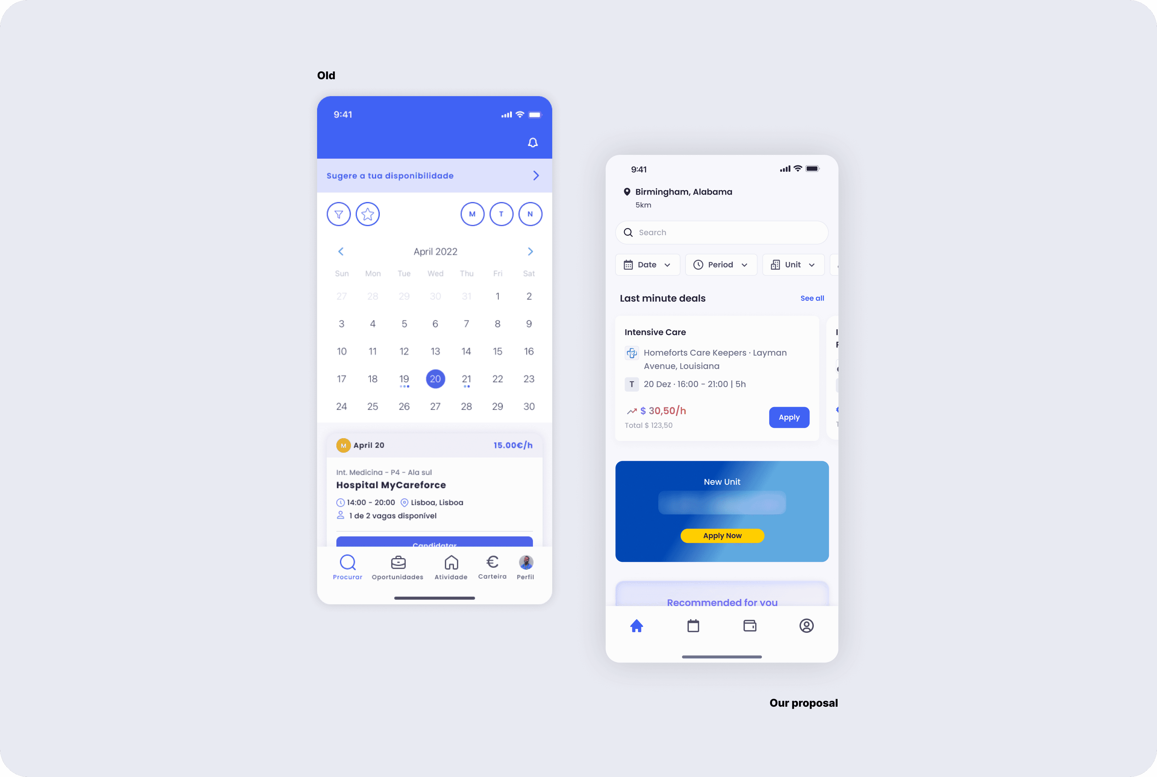
The original mobile app was cluttered, inconsistent, and difficult to navigate. Core actions like managing availability, checking upcoming shifts or applying for new ones, were buried or unintuitive. The visual design was also outdated, further eroding trust and usability.
This complexity led to frequent support tickets, poor App Store ratings, and negative feedback from professionals who used the app daily. It was clear we needed a full rethink.
Goals
Redesign the app with a focus on simplicity and clarity
Improve navigation and information hierarchy
Establish reusable design patterns for future features
Reduce user support dependency by improving self-service flows
As Lead Product Designer at MyCareforce, I collaborated closely with the Head of Product to lead the full redesign of our mobile app, used by healthcare professionals to manage their availability, shifts and work preferences.
The app serves as the professional-facing side of the MyCareforce marketplace, connecting healthcare workers with real-time shift opportunities posted by institutions. Given the nature of this two-sided model, our redesign had to balance usability, trust and responsiveness, helping users take quick action without confusion.
Problem
The original mobile app was cluttered, inconsistent, and difficult to navigate. Core actions like managing availability, checking upcoming shifts or applying for new ones, were buried or unintuitive. The visual design was also outdated, further eroding trust and usability.
This complexity led to frequent support tickets, poor App Store ratings, and negative feedback from professionals who used the app daily. It was clear we needed a full rethink.
Goals
Redesign the app with a focus on simplicity and clarity
Improve navigation and information hierarchy
Establish reusable design patterns for future features
Reduce user support dependency by improving self-service flows
Research
To ground our decisions, we conducted user interviews with nurses and TAS (technical assistants) across Portugal. These professionals used the app daily, making them the best source of truth.
We mapped out all the possible areas of improvement, then worked closely with the Head of Product and Head of Tech to prioritise what would drive the most business and user value. Our goal was to design broadly, then scope smartly.
One key insight was that users didn’t want to feel forced or penalised. For example, when cancelling a shift, the business initially wanted to require users to swap it. Through testing, we proposed a softer approach: recommend alternative shifts post-cancellation instead. This respected user autonomy while still increasing applications (a win-win for both sides).
Design Process
We worked in sprints, with design reviews every two weeks. But in practice, I requested feedback continuously. I believe designers grow faster and build better when they bring others into the process early and often.
I started as the sole designer on the project. As the work expanded, another designer joined the team and I naturally stepped into a lead role guiding the vision, mentoring, and aligning the work across product and tech.


When it came to handoffs, I kept things tightly documented: always working through user stories, attaching flows and final designs, and when needed, writing acceptance criteria to support implementation.
My goal was to reduce ambiguity and make collaboration with engineers as smooth and autonomous as possible. In faster-paced contexts, I adapt the depth of documentation based on scope but I always aim to leave a clear source of truth for whoever picks it up next.
Below is a real example of how I structure a user story: pairing documentation with flows and notes to ensure clarity from design to delivery.

Design Process
We worked in sprints, with design reviews every two weeks. But in practice, I requested feedback continuously. I believe designers grow faster and build better when they bring others into the process early and often.
I started as the sole designer on the project. As the work expanded, another designer joined the team and I naturally stepped into a lead role guiding the vision, mentoring, and aligning the work across product and tech.
When it came to handoffs, I kept things tightly documented: always working through user stories, attaching flows and final designs, and when needed, writing acceptance criteria to support implementation.
My goal was to reduce ambiguity and make collaboration with engineers as smooth and autonomous as possible. In faster-paced contexts, I adapt the depth of documentation based on scope but I always aim to leave a clear source of truth for whoever picks it up next.
Below is a real example of how I structure a user story: pairing documentation with flows and notes to ensure clarity from design to delivery.
Outcome
The redesign significantly improved the overall experience for healthcare professionals making key actions faster, clearer, and more reliable.
Early outcomes include:
A noticeable drop in support tickets related to availability and shift management
Improved user satisfaction, reflected in higher app store ratings post-launch
Positive feedback from professionals during onboarding and internal demos
More importantly, the redesign helped restore trust in the product showing users that their feedback directly shaped the experience.
A full rethink of the mobile experience transforming daily friction into intuitive, reliable workflows for healthcare professionals.