Design Systems Beyond Interfaces
Exploring how system thinking applies to visual identity design
Role
Thesis Author & Visual System Designer
Industry
Design Systems · Visual Design
Duration
2020 - 2021
Overview
While working as a frontend developer at doDOC, I helped implement their internal design system and saw firsthand how impactful it could be for collaboration, consistency, and scalability. This sparked a question:
What if we applied the same system thinking to brand identity design?
My thesis explored exactly that: adapting design systems (usually tied to product interfaces) to create a graphic identity system that could serve the full range of brand materials: digital and print, marketing and documentation, presentations and internal tools.
The Challenge
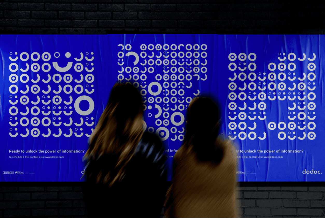
Graphic design assets, from presentations to posters, are often created without a unified system, leading to inconsistent visual communication and duplicated effort. At doDOC, the absence of a brand structure made it difficult to maintain coherence as the company scaled.
How could we bring the same clarity and modularity of digital design systems to brand identity?
Objectives
Build a graphic identity system inspired by digital design systems
Define a structure that scales across formats and platforms
Create a library of reusable components, styles, and rules
Document everything in a way that others could use and evolve
Overview
While working as a frontend developer at doDOC, I helped implement their internal design system and saw firsthand how impactful it could be for collaboration, consistency, and scalability. This sparked a question:
What if we applied the same system thinking to brand identity design?
My thesis explored exactly that: adapting design systems (usually tied to product interfaces) to create a graphic identity system that could serve the full range of brand materials: digital and print, marketing and documentation, presentations and internal tools.
The Challenge
Graphic design assets, from presentations to posters, are often created without a unified system, leading to inconsistent visual communication and duplicated effort. At doDOC, the absence of a brand structure made it difficult to maintain coherence as the company scaled.
How could we bring the same clarity and modularity of digital design systems to brand identity?
Objectives
Build a graphic identity system inspired by digital design systems
Define a structure that scales across formats and platforms
Create a library of reusable components, styles, and rules
Document everything in a way that others could use and evolve
Research & Foundations
I explored a range of design systems as inspiration, such as:
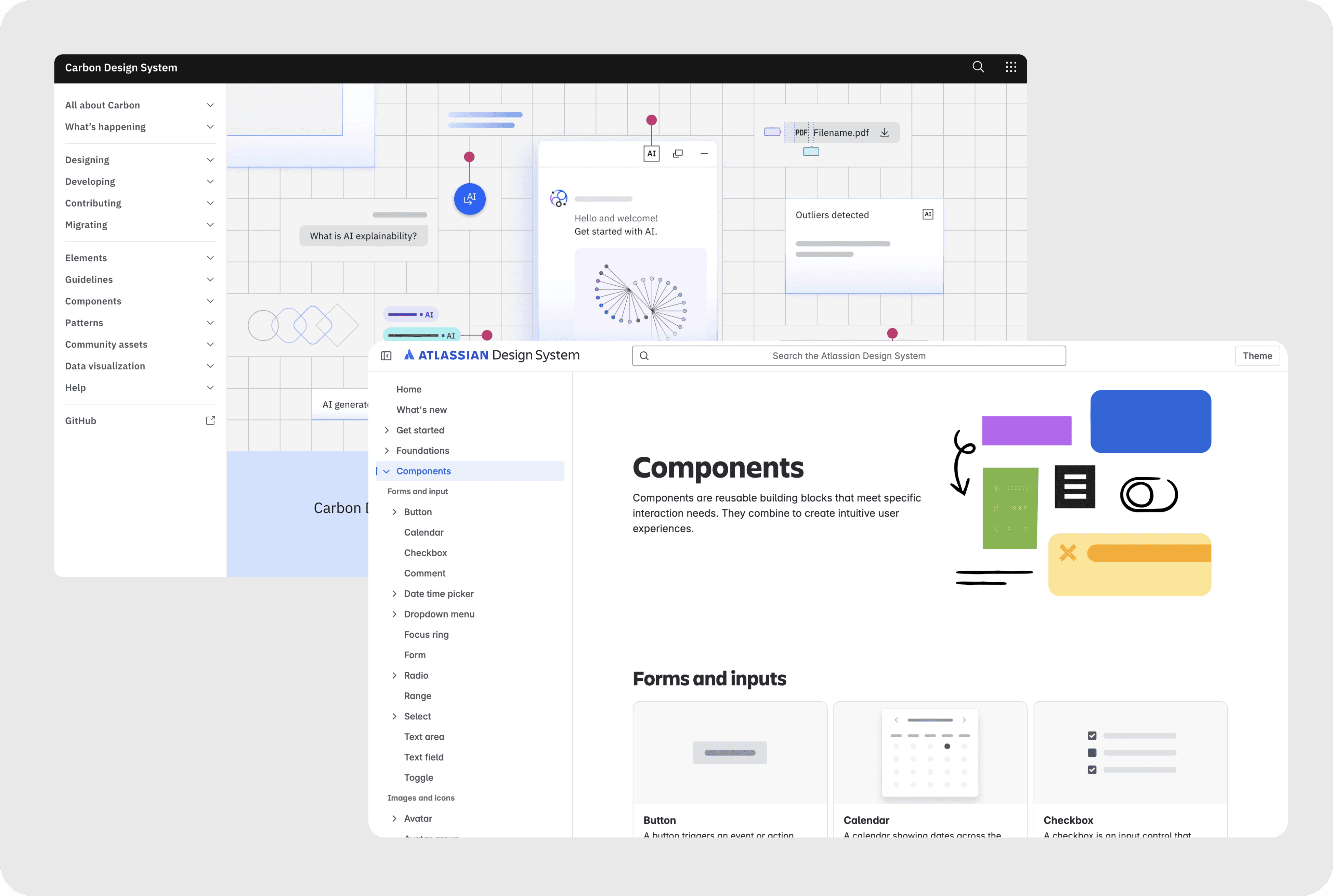
Carbon (IBM) and Spectrum (Adobe), particularly for their approach to color hierarchies and component documentation
Atlassian Design System for system logic and UX patterns
The Atomic Design methodology (Brad Frost) for hierarchy structuring
Alla Kholmatova’s work on purposeful components and design languages
Donella Meadows’ “Thinking in Systems” for systemic thinking beyond UI
System Structure
The system was built across two main pillars:
The Design Platform — visual principles, grids, typography, iconography, color palettes (for both digital and print)
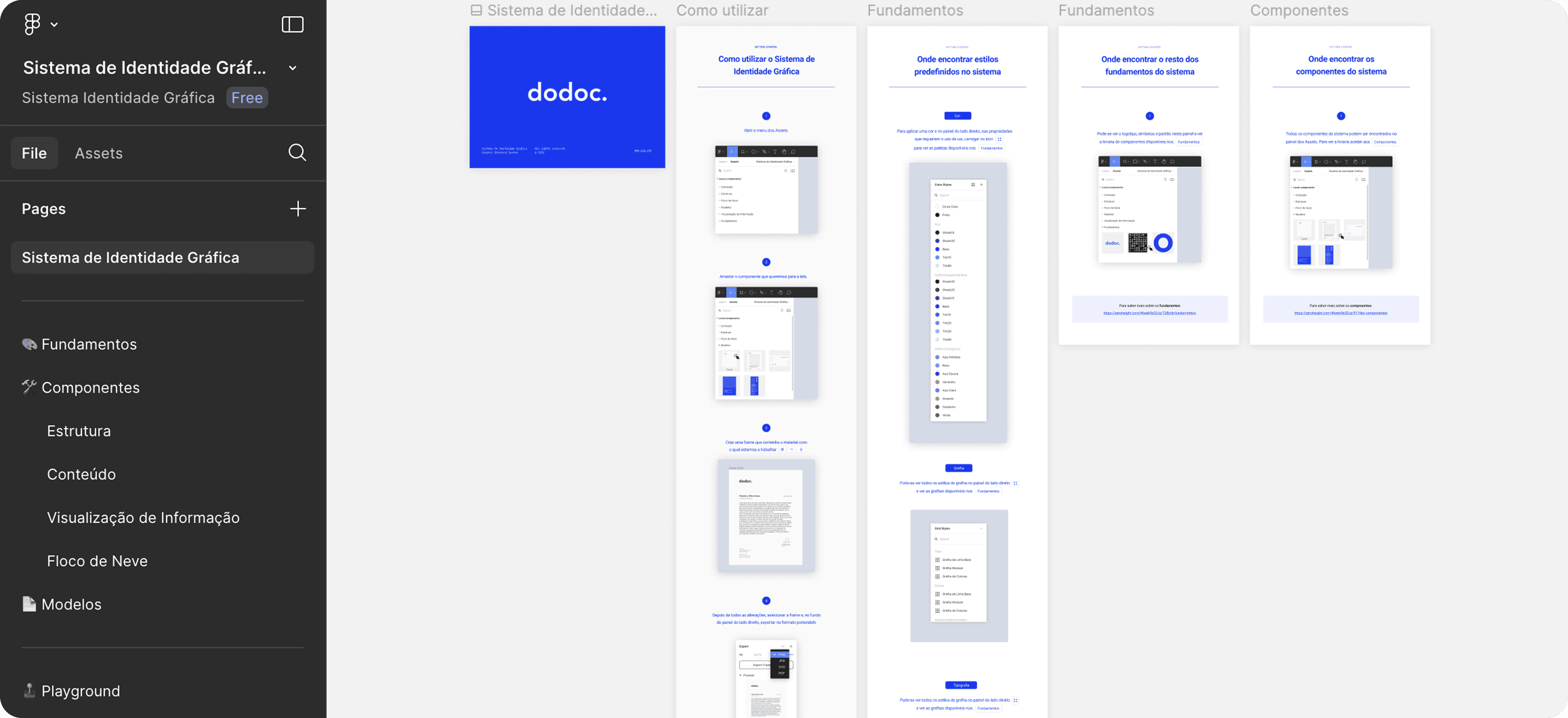
The Documentation Platform — templates and rules for using brand elements across real scenarios (social posts, decks, posters, reports)

Collaboration
Though this was an individual academic project, it was rooted in real-world collaboration. The graphic materials were based on existing brand assets at doDOC, and I worked closely with a fellow designer who was developing the company’s illustration system in parallel allowing for two distinct, but compatible visual languages to emerge.
Outcome
The final result was a scalable, documented design system that:
Structured doDOC’s visual identity into reusable components
Reduced time spent creating new brand assets from scratch
Ensured visual consistency across all design touchpoints
Laid a foundation that could grow and evolve with the team
Just like in product design, systems bring coherence and speed but they also create space for people to focus on the right problems.
Resources & Learnings
Even though this wasn’t a UI/UX case, it shaped the way I think about product design today.
It taught me that design isn’t just about solving one screen at a time, it’s about building systems that scale. That creating with intention means thinking about what others will need to use, evolve, and maintain after you. That good documentation is part of good design.
It also strengthened my foundations in visual design, understanding hierarchy, typography, grids, rhythm, and consistency. These are not just aesthetic concerns, they are what make a product usable, trustworthy, and professional.
By building this system from scratch and defining its logic, structure, and rules, I learned how to translate abstract design principles into something concrete, reusable and real. Something a team can grow into.
This mindset has shaped how I approach every product since.
It’s why I care about documentation. It’s why I push for consistent patterns.
And it’s why I believe systems are not a constraint, they’re a catalyst.
Curious to dive deeper?
You can read the full article (in Portuguese) here