Designing for Healthcare Scale
Improving clarity, efficiency and scale for healthcare institutions
Role
Product Design Lead
Industry
Health
Duration
On going

As Lead Product Designer at MyCareforce, I led the design of the enterprise platform used daily by hospitals and healthcare institutions to manage professionals, shifts and teams. The goal was to bring clarity, consistency and operational efficiency to a complex and critical product.
Context
Just like on the professional side of the platform, the enterprise experience had become outdated and misaligned with user needs. There was no coherent structure or logic behind most flows: basic actions like approving shifts or editing services were often unclear or buried. Users had to jump between screens to understand what needed attention, leading to confusion and inefficiency.
Feedback came directly from institutions, especially unit managers. They expressed frustration over not being able to perform essential tasks, like editing services, without running into friction. It became clear that the platform needed a full redesign to support both the day-to-day and long-term scalability.
Research & Discovery
We conducted interviews with unit managers who use the platform daily. Our goal was to understand how they navigated the system, where they clicked to complete tasks, and what caused the most frustration.
In parallel, I joined onboarding sessions for new institutions to observe first impressions: which actions caused confusion, which features were overlooked, and how intuitive (or not) the experience felt to a first-time user.
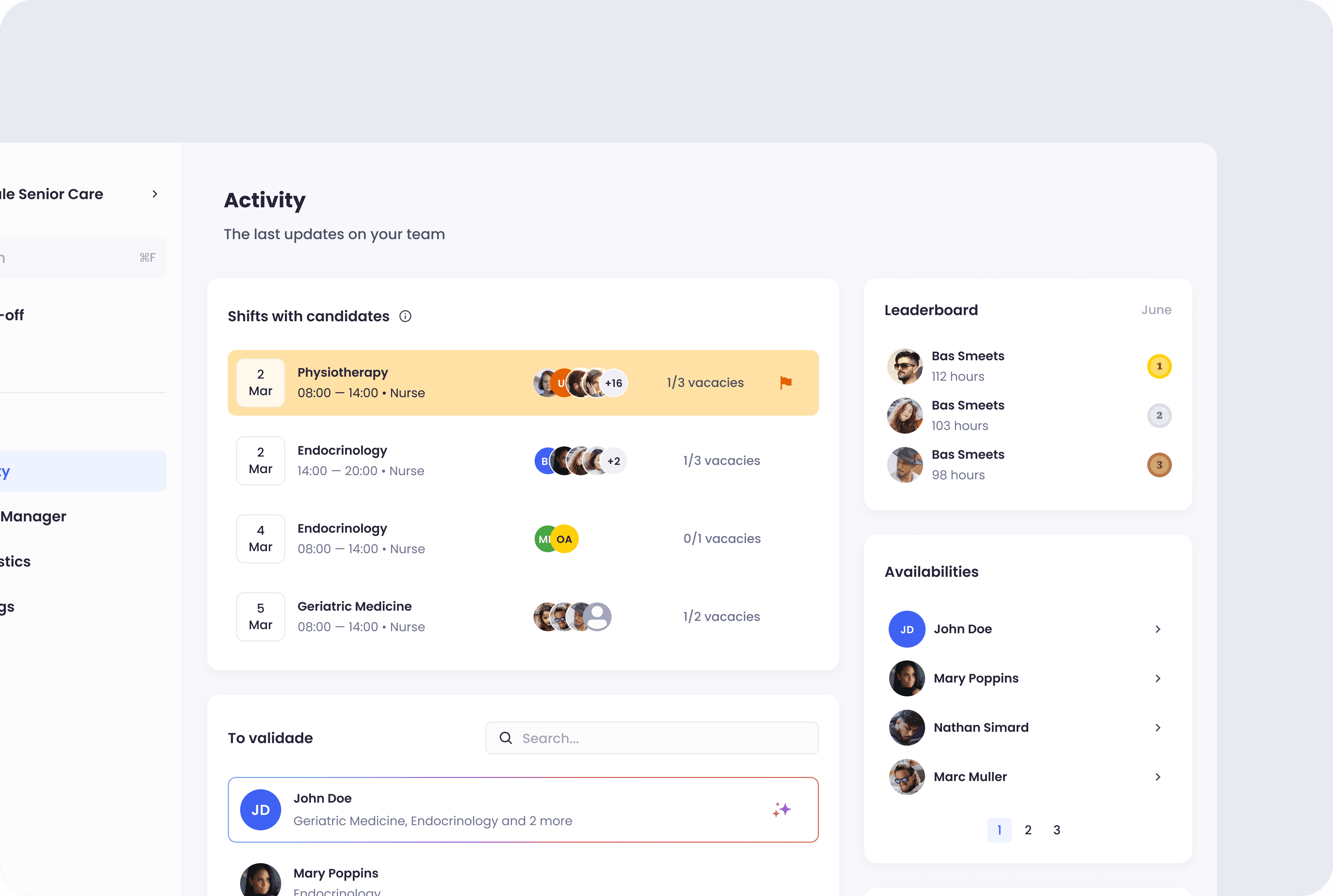
One of the biggest insights was that users lacked a central place to focus their attention. That led us to design a new "Activity" page — a dashboard with key alerts and widgets showing pending shifts and validations. We also prioritised redesigning the homepage, which houses the calendar and side panel, since it’s where users spend most of their time.
Design Process
From the start, I worked with a design system approach to bring structure and reusability into the product. However, since no equivalent existed on the development side, we encountered frequent inconsistencies which we tackled gradually through close collaboration and pattern documentation.
We worked in sprints, with regular design reviews. I maintained a feedback-driven process, often seeking input before rituals to ensure we were aligned early. I also led the work with another designer, setting direction, ensuring coherence, and staying hands-on throughout (startups don’t leave much room to be abstract).


Product Strategy
We prioritised strategic areas of the platform first. Starting with the homepage and then building the new Activity view. These decisions were informed by usage data, user interviews and support insights.
I also focused heavily on creating consistent patterns across pages. If a user performs an action in one place, the logic and interaction should match elsewhere. This made the experience more predictable and scalable.
Design Process
From the start, I worked with a design system approach to bring structure and reusability into the product. However, since no equivalent existed on the development side, we encountered frequent inconsistencies which we tackled gradually through close collaboration and pattern documentation.
We worked in sprints, with regular design reviews. I maintained a feedback-driven process, often seeking input before rituals to ensure we were aligned early. I also led the work with another designer, setting direction, ensuring coherence, and staying hands-on throughout (startups don’t leave much room to be abstract).
Product Strategy
We prioritised strategic areas of the platform first. Starting with the homepage and then building the new Activity view. These decisions were informed by usage data, user interviews and support insights.
I also focused heavily on creating consistent patterns across pages. If a user performs an action in one place, the logic and interaction should match elsewhere. This made the experience more predictable and scalable.
Outcome
Though still evolving, the new platform structure has already improved:
- User orientation and clarity for high-frequency tasks
- Visibility of pending actions through the Activity page
- Internal alignment around consistent design logic and scalability
The new Activity page has been particularly impactful, giving institutional users a clear view of what requires their attention without needing to jump between screens or rely on external tools.
Institutions across Portugal and Brazil rely on this platform to manage:
- Over 230 healthcare units
- 311,000+ hours filled in 2024
- €4M+ and R$520K paid to professionals
A product designed to bring clarity to complexity with a structure that grows with the needs of healthcare institutions.